
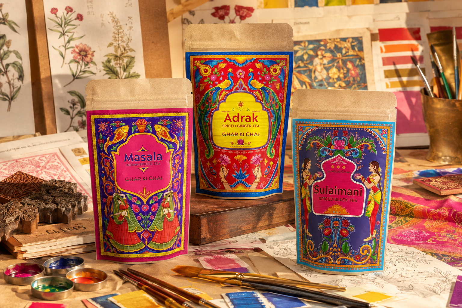
Before anyone tastes a Ghar Ki Chai blend, they meet the packet. We wanted that first encounter to feel nothing like the quiet, neutral packaging that fills so many kitchen shelves.
Chai has never felt minimalist to us
Our memories of chai are surrounded by colour: patterned textiles, painted steel cups, bright sweet boxes, flower garlands, spice tins and the artwork found on everyday Indian objects. The ritual may be simple, but its world is visually rich.
That became the starting point for the packs. Each one uses ornament, illustration and saturated colour to signal that this is not a generic hot drink. It belongs to a specific cultural imagination.
Giving every flavour a personality
Masala is generous and celebratory. Adrak feels energetic and bold. Sulaimani is lighter, floral and distinct from milky chai. The imagery helps each blend develop a character before the customer reads the ingredients.
At the same time, the range needs to feel like a family. Repeating frames, decorative details and the Ghar Ki Chai name connect the products even when their colour palettes differ.
Designed to be left out
Packaging also lives in the home. A chai packet is handled daily, left beside the kettle and seen by visitors. We wanted ours to feel like something people might enjoy keeping on display rather than hiding in a cupboard.
The packet should carry some of the joy of the cup inside it.
As Ghar Ki Chai evolves, the visual language will evolve too. But the principle will remain: Indian culture is not a decorative trend added at the end. It is the source material - and it deserves to be expressed with confidence.
