
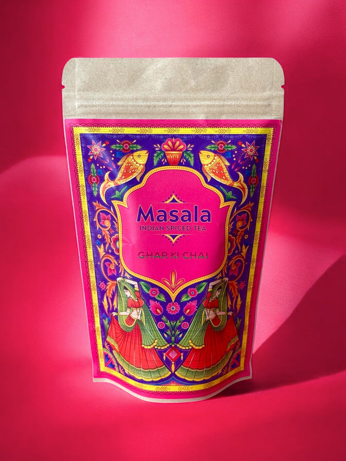
Put the two packets side by side and they scarcely look related. One is quiet and restrained, with a small central label and plenty of space around it. The other is saturated with colour, pattern and detail. Both say Ghar Ki Chai. They simply say it in very different voices.
The packaging has changed as visibly as anything else around the brand. Looking back at an earlier pouch now is a useful reminder that a packet does more than keep chai inside. Before anyone tears it open, it has already begun to tell them what sort of world the chai belongs to.

A quieter beginning
Visually, the early pack was simple. A kraft-coloured pouch, a dark rectangular label, the Ghar Ki Chai mark at the centre. It felt practical and familiar, closer to something you might find tucked into a kitchen cupboard than displayed prominently on a shelf.
The current packets are much less shy. Masala is framed by jewel-like borders and miniature details. Adrak has its own vivid palette. Across the range, colour now does a lot of the talking. The pouch itself is still recognisably a pouch, but the front has become a small canvas.
More of the ghar on the outside
That shift feels appropriate for chai. Chai is rarely a neutral thing. It is noisy kitchens, particular mugs, family preferences, spices that announce themselves before the cup reaches the table. A very quiet packet can hold all of that, of course, but it does not necessarily hint at it.
Packaging is one of those parts of building a food brand that is easiest to notice when something feels wrong. When it works, the individual choices disappear into the whole. The proportion of the label, the amount of empty space, how a colour behaves in daylight, whether a packet still feels good in the hand. Small decisions accumulate until the object feels settled.
The older pouch is still useful to look at. It shows where Ghar Ki Chai began visually. The newer one shows how much more of the ghar eventually made its way onto the outside. For now, both belong in the same story.
